I have just returned from two days of prayer and fasting with 600 leaders within the Newfrontiers family. Both from these days and from various recent conversations I have become conscious that many in the Newfrontiers family of churches are unaware of some of our roots which go back 30 years. Accordingly, at a time when we are going through major transition towards a new season I felt it would be of interest to give some history of the name and the development of the logo.
Branding

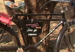
 To some people branding is quite unattractive as it has implications of multi-national companies. However, when I travel and see our logo on the side of a mini-bus in Guinea or on the cross bar of a pastor’s bicycle in Kenya I realise what a strong brand our logo provides. It speaks to the wider community and carries hidden messages about our vision and values.
The name
When Terry Virgo first invited a team to work with him in September 1980 we needed a name. We chose ‘Coastlands’ which, in the book of Isaiah, refers to the ends of the earth. However, it soon became clear that, because he was living in Brighton on the south coast of the UK, people were misunderstanding Terry’s motivation – to go to the nations – and interpreting Coastlands as referring to the south east of England.
After a few years we decided to change to a non-Biblical(!) name, New Frontiers. Quickly this was extended to New Frontiers International and the well-known NFI.
The logo
As we prayed about a logo we felt that we wanted something that showed our international vision, and Geoff Gillard from the Newfrontiers church in Biggin Hill designed a schematic world with arrows encircling it.
Over the next 20 years Newfrontiers grew and our activities included Bible Weeks. From 1979-1988 the Downs Bible Week (which began before Terry formed a team) was held annually in Sussex, and from 1991-2001 the Stoneleigh Bible Week was held near Coventry. The final Stoneleigh Bible Week was attended by 28,000 people.
By then we were approximately 250 churches in about 25 nations. We decided that we should rebrand to mark the next season, reflecting the prophetic word with which we left Stoneleigh – ‘Let’s Go’.
First we dropped ‘International’. It had become self evident that we were international so we did not need to advertise the fact. Then we acknowledged that the two words ‘New Frontiers’ had caused us difficulties in various nations since the words translated in some languages to mean ‘New Barriers’. So we decided to coin a new word ‘Newfrontiers’. Our intention was that this should not be translated but, as a word, should form an integral part of the logo which would appear internationally. Third, we liked the energy of the arrows so decided to keep this dynamic feel in the form of the now familiar ‘swirls’.
What about the colours?
The colours we had been using, red and blue, are predominantly ‘northern hemisphere’ colours. Since we were now truly international we wanted the colours to reflect this. So we included green and gold as these tend to be more characteristic of the southern hemisphere. We asked Adrian Willard and his team to take this brief and design some options for us. Frequently this includes a tag line.
The result is now recognised around the world and will, as we move into the next season and become more widespread, be one of the features that help to give our ‘family’ identity. I hope this explanation will help those in Newfrontiers churches to understand better why it is as it is!
For those in Newfrontiers churches or running Newfrontiers events who need information about how to use the artwork please contact josie.milligan@newfrontierstogether.org


